Made Manifesto
VI. Mobile First
August 24, 2017

When we first put Mobile First into our manifesto, we were on the verge of an inflexion point.
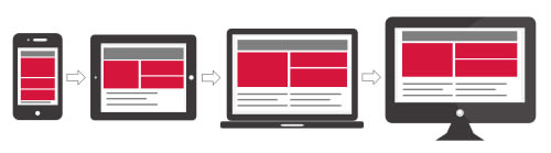
Analytics were bearing out that within a year or two mobile would take over desktop computers as the dominant computing platform. Web designers with vision were asking ‘why wait?’ If the lifespan of a website was three to five years you needed to design right now for a primarily mobile audience. We adopted ‘responsive’ design as standard in 2010. By 2013, we were considering mobile the dominant use case.
That started with our website for Royal Albert Hall, which actually got featured in the Responsive Design Podcast by Ethan Marcotte, the man who coined the term responsive design.
In 2017 we’re already way past the inflexion point. Mobile usage currently accounts for 60% of the traffic to a typical client’s website. The 60% figure includes both tablets and phones, but even this distinction is starting to blur as phones get bigger and tablets smaller.

The line between my mobile web browser, my Facebook app and my credit card is blurring.
What does designing mobile first mean? Well, it’s not just about putting everything in one nice long and narrow scrolling column. Especially one that makes my laptop feel like an oversized phone, my pixels wasted on huge type, with hero-images that don’t quite fit my viewport without scrolling.
The way we interact with our mobile devices is different. Mobile devices are personal, social and interactive. The line between my mobile web browser, my Facebook app and my credit card is blurring. My digital world is starting to coalesce around me, via a hub of familiar and friendly app platforms, and the mobile presences we design for our clients need to start infiltrating that hub like good citizens.
Interfaces need to get simpler. But our expectations of consumer interactions, from promotions, trust and security to loyalty, recognition and sharing, are getting more complex.
Another way of thinking about it, is that the user experience needs to come and find your customers, in context, pre-empting their needs, rather than expecting your customers to take the initiative.
For example:
-
If my phone already authenticates with Apple, Google and Paypal, do I really need to register with you? Can’t you just grab what you need from them?
-
Are you really going to email me a PDF of my tickets, or can they just appear in my virtual wallet?
-
Am I really supposed to trust your ‘Getting Here’ page over the Maps app on my phone, and its traffic-aware directions?
-
Are you sure I’m going to visit your ‘Watch & Listen’ section, when all my video comes to find me in an app called YouTube that knows the kind of thing I like?
-
Are you going to waste my precious screen-space on words explaining why this interaction doesn’t make sense, or are you just going to remove that redundant feature that’s the root cause of the confusion?
In order to support mobile interaction, interfaces need to get simpler. But our expectations of consumer interactions, from promotions, trust and security to loyalty, recognition and sharing, are getting more complex. This really is a huge design challenge. Much more serious than squeezing some content into a narrow viewport.
I like it for what it doesn’t do, as much as for what it does.
My favourite ‘Mobile First’ experience is the Hotel Tonight app. I like it for what it doesn’t do, as much as for what it does. The experience is so focused, personal and convenient, and couldn’t really exist outside a mobile sphere. The interface is visual, simple and easily navigable by thumb. Calls to action are clear and unmistakable. It only requests the exact information it needs, and it remembers it. Your loyalty is rewarded, but you don’t have to work for it by remembering some special member log in. In fact it’s only ever used my Facebook log-in, and it almost never needs to ask for that.
Apply some of that thinking to a concert booking experience
-
It’s usually two tickets. Can you pre-fill two and make it easy to change?
-
You can default to the first available night too. I’ll search if that doesn’t work for me.
-
No need to log me in. Facebook has my details.
-
Give me the best seats you can in my price range, I might change post-sale.
-
Paypal or Apple Wallet has my credit card, and my billing and shipping address.
-
You can drop the tickets into the My Concerts tab, along with the seat upgrade features and my need-to-know info.
Mobile-first design, actually means doing less, and thinking carefully about what we are doing. Are we improving convenience? Are we allowing our users to do more, without increasing their cognitive load? Are we fitting into their digital life? Or are we still expecting them to do all the work for us?
Required Reading
-
Responsive Web Design, since its groundbreaking release in 2011, this book remains a fundamental resource for anyone working on the web.
-
Mobile First, former Yahoo! design architect Luke Wroblewski knows more about mobile experience than the rest of us, and packs all he knows into this entertaining, to-the-point guidebook.
-
Responsive Web Design Podcast Who visits the Royal Albert Hall on their phone? Louise Halliday and Jake Grimley report that designing mobile-first means a website that works better for everyone.
-
Hotel Tonight make it remarkably easy to book great hotels at amazing last-minute rates on your mobile device.
Next Month: Show Don’t Tell


Subscribe to the
newsletter
Sign up now to our utterly private, spam-free and occasionally insightful newsletter.